
Understanding Stock Charts and Price Movements
SAHI
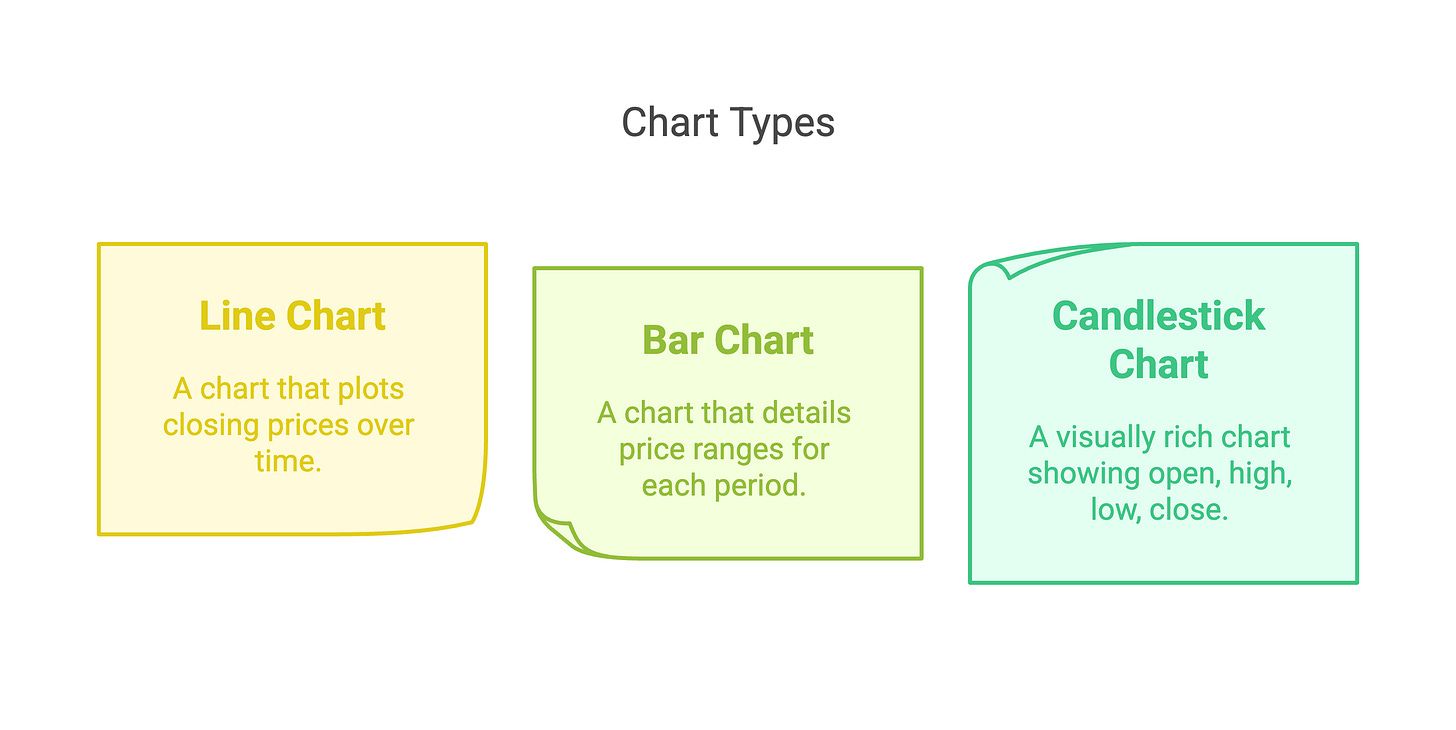
A stock chart is a visual graph of a stock's price over time. Charts help traders quickly spot whether a stock is rising, falling, or moving sideways — without reading through rows of numbers. The three most common chart types used in Indian markets are the line chart, bar chart, and candlestick chart, each showing different levels of price detail.
Charts tell the story of a stock's price. Instead of just seeing numbers, you get a visual picture of how the price has moved over time.
Charts help you quickly spot three things: trends (is the stock going up or down?), volatility (how sharply does it swing?), and key price levels.
Mastering charts is one of the most important skills in trading. Think of it as learning to read the market's diary.
There are several kinds of charts. Here are the three most common ones you'll see on Sahi or any trading platform:
-
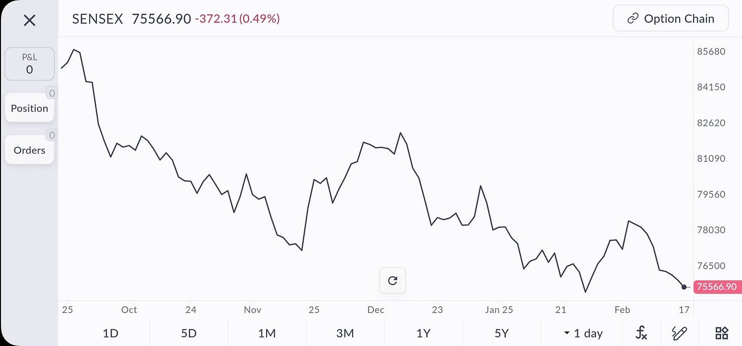
Line Chart: A line chart plots closing prices over time and connects them with a single line. It gives you a clean view of the overall price trend.
For example, a line chart of Tata Motors might show the stock rising from ₹300 to ₹400 over six months. Line charts are easy to read but do not show intra-day price detail.
-
Bar Chart: A bar chart shows more detail for each time period. Each day is represented by a vertical line stretching from the day's low to its high.
Small horizontal ticks mark the opening and closing prices. The left tick is the opening price. The right tick is the closing price.
If the right tick is higher than the left, the price rose that day. If it is lower, the price fell. This format is called OHLC — open, high, low, close.
For example, a single bar for Infosys might show a low of ₹1,480, a high of ₹1,530, an open of ₹1,500, and a close of ₹1,520. This tells you Infosys closed higher than it opened that day.
-
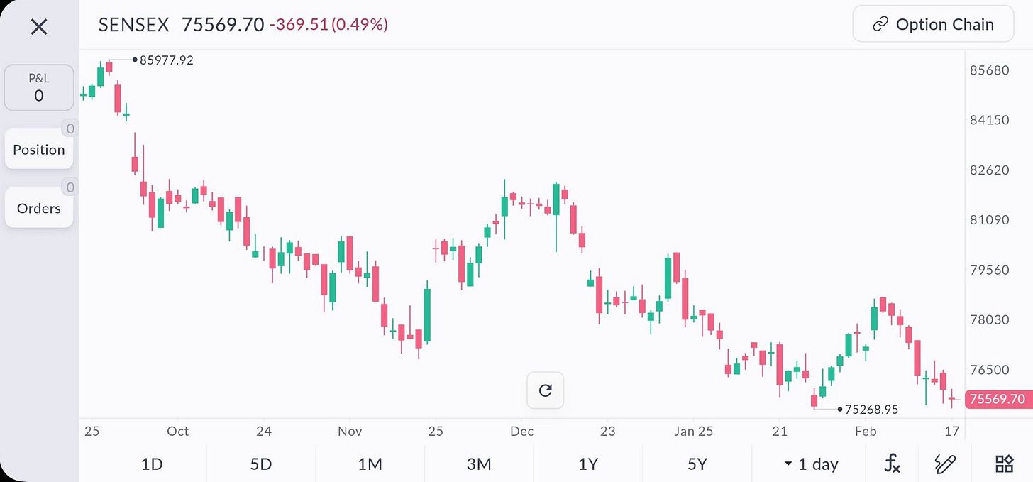
Candlestick Chart: Candlestick charts are the most popular chart type among traders. They show the same OHLC data as bar charts, but in a more visual format.
Each period is a "candle" with a body (the range between open and close) and wicks (thin lines showing the high and low).
A green (or white) candle means the stock closed higher than it opened. A red (or black) candle means it closed lower.
Candlesticks make it easy to spot patterns at a glance. We'll cover them in detail in the next module.
Reading Basic Price Movements
Regardless of chart type, start by looking at the overall direction of the price.
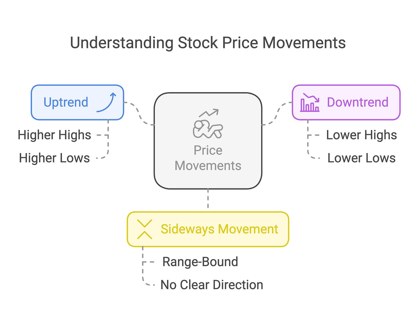
There are three basic movements to identify:
- Uptrend — Each successive high is higher than the previous one. The lows also tend to be higher. The stock is climbing.
- Downtrend — Each successive low is lower than the previous one. The highs are also lower. The stock is falling.
- Sideways (range-bound) — The stock oscillates between roughly the same high and low. There is no clear upward or downward path.
Here is a simple example using HDFC Bank:
- Shares move from ₹1,000 to ₹1,100 over a month → uptrend
- Shares slide from ₹1,100 back to ₹1,000 → downtrend
- Shares bounce repeatedly between ₹1,000 and ₹1,050 → sideways range
As a beginner, focus on identifying these three broad movements first. Everything else in technical analysis builds on this foundation.
Next, we'll zoom in on candlestick charts and learn how to read the unique patterns they form.
2: Understanding Candlestick Patterns

Candlestick charts are a favourite tool because they pack a lot of information into each "candle" and they form patterns that can hint at what might happen next. In this module, let's break down candlesticks and learn some common patterns.